Introduction
In a crowded retail aisle or endless e-commerce scroll, shoppers make purchase decisions in milliseconds—not minutes. Cambridge University research reveals that consumers can make above-chance food choices in just 313 milliseconds, with the average in-store purchase taking around 13 seconds. In that blink-and-you'll-miss-it window, your packaging is the only salesperson on duty.
The stakes are staggering. Tropicana's 2009 packaging redesign—which stripped away the iconic orange-and-straw imagery—resulted in a 20% sales drop and $33 million loss in just seven weeks. Meanwhile, disruptive brands like Liquid Death turned water into a $1.4 billion valuation business almost entirely through bold, unexpected packaging.
Your packaging can do the same — or it can quietly cost you. This guide breaks down the elements that make F&B packaging work: design fundamentals, current trends, sustainability requirements, and the production details that turn great concepts into shelf-ready reality.
TLDR
- F&B packaging has 313 milliseconds to capture attention—design for instant recognition
- Color, typography, imagery, and structure must work together to communicate what your product is and why it's worth buying
- Sustainability is table stakes now. Greenwashing doesn't fool shoppers—it loses them.
- Skipping shelf-context testing, inconsistent SKU branding, and late FDA compliance reviews are the fastest ways to redo expensive work
Why Packaging Design Is Your Brand's Most Powerful Sales Tool
F&B packaging serves dual duty: protecting the product while communicating brand value. With 76% of grocery purchase decisions still made in-store, packaging does all the persuasion work—no salesperson involved.
Premium-looking packaging leads consumers to assume higher product quality before they ever open the product. A 2026 study found U.S. wine consumers have the highest willingness to pay for traditional glass bottles compared to alternatives like PET or flexible bags—because glass signals premium quality at a glance.
The $33 Million Cautionary Tale
When Tropicana replaced its iconic orange-and-straw packaging with minimalist design in January 2009, unit sales dropped 20% within seven weeks, representing roughly $33 million in lost revenue. By late February, PepsiCo reverted to the original design, with executives admitting they "underestimated the deep emotional bond" consumers had with the familiar look.
Disruption Through Design
Not every successful redesign plays it safe. Two brands built their identities entirely around packaging that broke category conventions:
- Liquid Death reached a $1.4 billion valuation and $333 million in 2024 revenue selling mountain spring water in heavy-metal aluminum tallboy cans with a gold skull logo and "Murder Your Thirst" tagline—turning a commodity product into a cultural statement.
- Olipop surpassed $200 million in sales using vintage-inspired design to make gut-health soda feel approachable. The nostalgic aesthetic signals cleaner ingredients without resorting to clinical health messaging.
Packaging doesn't just communicate information—it creates emotional associations: nostalgia, excitement, trust, or luxury. Ultimately, your design must answer the consumer's unspoken question: "Is this for someone like me?"
The Key Design Elements That Make F&B Packaging Stand Out
Effective F&B packaging relies on four core levers: color, typography, imagery, and structure. Each must align with brand identity and target audience—not just aesthetic preference.
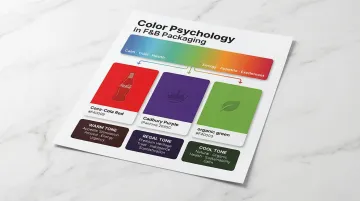
Color
Color is processed first by the human eye, triggering instant emotional and category associations. Research shows that cooler colors (blue/green), higher brightness, and lower saturation implicitly signal healthiness and sustainability, while warm colors (red/yellow) stimulate appetite and arousal.
Strategic color ownership examples:
- Coca-Cola red – Integrated for over a century, creating instant global recognition
- Cadbury purple – Fought extensive legal battles to trademark Pantone 2685C for chocolate packaging
- Green for natural/organic – Signals health and sustainability across categories
Typography
Typeface communicates brand personality before a word is read. A chunky, playful font signals fun and accessibility (think children's snacks), while serif or script fonts communicate heritage and quality (premium coffee, wine).
Style means nothing if shoppers can't read it from three feet away. Key legibility rules to follow:
- Shelf readability – Test typefaces at actual shelf distance before finalizing
- FDA compliance – Ingredient lists must use type at least 1/16 inch tall
- Hierarchy – Brand name, variant, and key claim should each read at distinct visual weights
Imagery and Visual Storytelling
Imagery—whether photography, illustration, or pure graphic design—should answer: "What kind of person uses this, and what will this do for me?"
Illustration trend examples:
- Oatly abandoned traditional dairy norms in 2014 for hand-drawn typography and conversational copy ("WOW! NO COW!")
- Tony's Chocolonely uses bold, asymmetrical wrappers to highlight its mission to end cocoa exploitation
- Ben & Jerry's recent redesign brought massive illustrated ice cream mounds to the center, resulting in 78% consumer purchase preference over the old design
When to show the product: Showing the actual product typically outperforms lifestyle imagery when consumers need to evaluate quality, freshness, or ingredients at a glance.
Structure and Format
Physical structure—bottle shape, box architecture, pouch format, can design—creates differentiation that 2D graphics cannot. Uniquely shaped bottles, resealable pouches, or packaging that doubles as a serving vessel can become a brand's most defensible asset.
All four elements have to work together to create clear visual hierarchy. Brand name, key benefit, and product variant must be instantly readable in the correct priority order — because at shelf, you have about two seconds to make an impression before a shopper moves on.
Current Trends Reshaping Food and Beverage Packaging Design
The F&B packaging market is shaped by shifting consumer values, new beverage categories, and rapid technology shifts. Brands that read these trends correctly gain shelf advantage.
Disruptive and Authentic Branding
Most categories have unwritten visual rules—colors, fonts, layout. Brands can either follow them to appear trustworthy or break them deliberately to stand out.
Liquid Death broke every category convention for water packaging, using beer-style cans and heavy-metal aesthetics. The key principle: authenticity to your brand's actual story matters more than chasing trends. Consumers punish brands that adopt trendy aesthetics without substance.
The Rise of the Can (and Smaller Formats)
Aluminum cans dominate growth across functional beverages, RTD cocktails, mocktails, and even wine—driven by strong recyclability credentials and design flexibility. Grand View Research projects the global RTD cocktails market will grow from $3.69 billion in 2025 to $10.72 billion by 2033, at a 14.1% CAGR.
NIQ reports that Gen Z (21+) and Millennials drive 76% of growth in smaller spirits formats (50ml and 375ml), favoring these sizes for portion control, discovery, and impulse-driven social occasions.
Minimalism and Clean Label Design
The "less is more" movement strips back visual noise to lead with clean ingredient communication. Innova Market Insights reports that 58% of global consumers want clear information about ingredient origins, pushing brands toward simpler, more transparent designs.
Clean label design typically means:
- Transparent windows or panels showing the product directly
- Short ingredient lists with recognizable, everyday language
- Uncluttered layouts that let key claims (non-GMO, organic, gluten-free) lead visually
Interactive and Collectible Packaging
Limited edition designs, QR codes linking to brand stories, and packaging with a second use or collectible quality drive social sharing and brand loyalty.
Campaign examples:
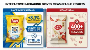
- Lay's "Smile" campaign featured real people's smiles on packaging with QR codes and AR, delivering +8.3% sales growth, over 71,000 bag scans, and 917 million media impressions
- KitKat Japan has produced over 400 limited-edition seasonal and regional flavors, with 2019 paper packaging designed to fold into origami cranes
One structural shift worth noting: by 2027, the industry is transitioning from 1D barcodes to 2D GS1 QR codes. In 2025, Tesco launched a pilot replacing traditional barcodes with GS1 QR codes on meat and produce to track batch numbers, use-by dates, and provide consumer transparency.
Sustainability in F&B Packaging: Going Green Without Greenwashing
Sustainability has moved from differentiator to baseline expectation. McKinsey's 2025 survey reveals that over 50% of global consumers are still willing to pay more for sustainable packaging, despite economic pressures.
Legitimate routes to sustainable packaging:
- Biodegradable and compostable materials that meet ASTM D6400 standards and BPI certification
- Lightweight structures that reduce material per unit — and lower your carbon footprint
- Single-material recyclable formats, which move through existing recycling streams far more easily than mixed laminates
- Reusable packaging designed for multiple use cycles
The risks of overstating your sustainability credentials are concrete. Keurig Canada was fined $3 million by the Competition Bureau in 2022 for misleading claims about K-Cup recyclability. Today's consumers notice — and they don't forget.
Done right, sustainability becomes a genuine design asset. Johnnie Walker's Blue Label Ultra unveiled the world's lightest 70cl Scotch whisky glass bottle at just 180g, developed over five years and positioned as a premium innovation. The result shows that sustainability and luxury packaging aren't mutually exclusive.
Common F&B Packaging Design Mistakes to Avoid
Mistake 1: Designing Without Knowing Your Shelf Context
Packaging designed in isolation — on a white background or a screen — often fails in the real world. Retail shelves are crowded, and competing products create serious visual noise. Research what competitors' packaging looks like at shelf, then design to stand apart within that context.
Mistake 2: Inconsistent Branding Across SKUs or Pack Sizes
When a product line uses mismatched fonts, colors, or imagery across variants, it erodes brand recognition and makes the range look unplanned. A cohesive brand system that flexes across SKUs makes the product line look intentional and trustworthy.
Mistake 3: Neglecting Compliance and Regulatory Label Requirements
Food and beverage packaging must meet FDA labeling requirements under 21 CFR 101:
| Requirement | Key Details |
|---|---|
| Statement of Identity | Must appear on the Principal Display Panel (PDP) |
| Net Quantity | Must be in bottom 30% of PDP, expressed in metric and U.S. Customary systems |
| Ingredient List | Listed in descending order of predominance by weight; type size at least 1/16 inch |
| Nutrition Facts | Updated 2016 format reflecting added sugars; must be set off in a box |
| Allergen Declarations | As of January 1, 2023, sesame is the 9th major food allergen |
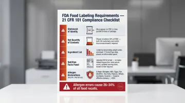
The financial exposure here is real. Undeclared allergens account for 26–34% of all food recalls, with over 60% caused by labeling and packaging errors. Packaging artwork errors cost businesses $5,000 to $50,000+ per incident in material waste, labor, rush surcharges, and delays.
That's why compliance requirements belong in the design brief from day one, not added as a final check after creative is approved.
From Design Vision to Finished Packaging
Many brands fall into the gap between great creative concepts and manufacturable, retail-ready packages. Beautiful mockups fail in production due to print process limitations, material constraints, or cost overruns.
The "Rule of 10" in packaging economics: The cost to resolve a design issue increases tenfold at each subsequent stage of development. Flexographic printing plates (the physical molds used in high-volume print runs) cost $150 to $2,000 per color — and rush fees for late-stage changes can add 20% to 200% above standard rates.
Standard development timeline: Simple packaging projects (1 SKU) typically require 5-6 weeks from brief to production files. Complex, multi-SKU projects need 8-16 weeks. That window covers research, concept development, testing, revisions, and final production files — and it fills up faster than most brands expect.
Working With an Experienced Packaging Partner
Design intent and production reality don't always speak the same language. Consolidated Design West has spent over 34 years translating between the two — helping food and beverage brands move from approved concept to shelf-ready packaging without costly detours.
CDW's services cover the full packaging stack:
- Primary packaging: plastic bottles and containers (PET, HDPE, LDPE), glass, metal cans, aluminum tubes, and flexible pouches
- Secondary packaging: corrugated boxes, folding cartons, cardboard trays, shrink wrap, and overwrap
- Print processes: digital, offset, and flexography with finishing treatments for shelf impact
- Turnkey co-manufacturing: through Respect Manufacturing, CDW handles custom formulation, filling, quality control, and regulatory compliance under one roof
One practical note: Bring your packaging partner in during the briefing or concept stage — not after the design is locked. Structural options, material choices, and print finishes all shape what's creatively possible. Discovering a constraint after final approval is how a 6-week project becomes a 10-week one.
Frequently Asked Questions
What makes food and beverage packaging design effective?
Effective F&B packaging combines strong visual hierarchy, clear brand communication, and shelf differentiation while aligning with target consumer expectations. It must signal value and quality instantly—within 313 milliseconds—using color, typography, imagery, and structure strategically.
How does packaging design affect purchasing decisions?
Most in-store purchase decisions are made at shelf in seconds, and packaging is often the only brand communication present. It signals relevance and quality before the product is ever tried, making it a decisive sales tool for F&B brands.
What are the biggest packaging design trends in food and beverage right now?
Four trends are reshaping F&B shelves right now:
- Disruptive, authentic branding that breaks category conventions
- Aluminum can format dominance across beverage categories
- Minimalist clean-label design emphasizing ingredient transparency
- Interactive or collectible limited-edition packaging that drives social sharing
What is the difference between primary and secondary packaging in food and beverage?
Primary packaging directly contacts the product (bottle, can, pouch, jar) and must meet food safety standards. Secondary packaging groups or protects primary units (box, carton, shipper, tray) for distribution and retail display. Both impact brand perception and should be designed cohesively.
How important is sustainability in F&B packaging design today?
Sustainability is now a baseline consumer expectation, not a premium feature. Over 50% of consumers are willing to pay more for sustainable packaging, but brands must back claims with genuine material choices and certifications to avoid greenwashing backlash and regulatory penalties.
When should I involve a packaging partner in the design process?
Involve packaging partners early—ideally during the briefing or concept stage—so structural options, print capabilities, and material specifications can inform creative decisions. Getting them in early prevents costly rework and keeps your design manufacturable from day one.